🎉 BOGO Summer Sale: Buy Any Eligible Course, Choose Another FREE!
Your free course will be added to your account within 24 hours. Contact us after purchase to choose your complimentary course.
Member's schedule
Log In


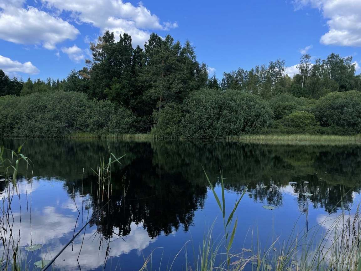
Right-click and open in a new tab to enlarge and print.
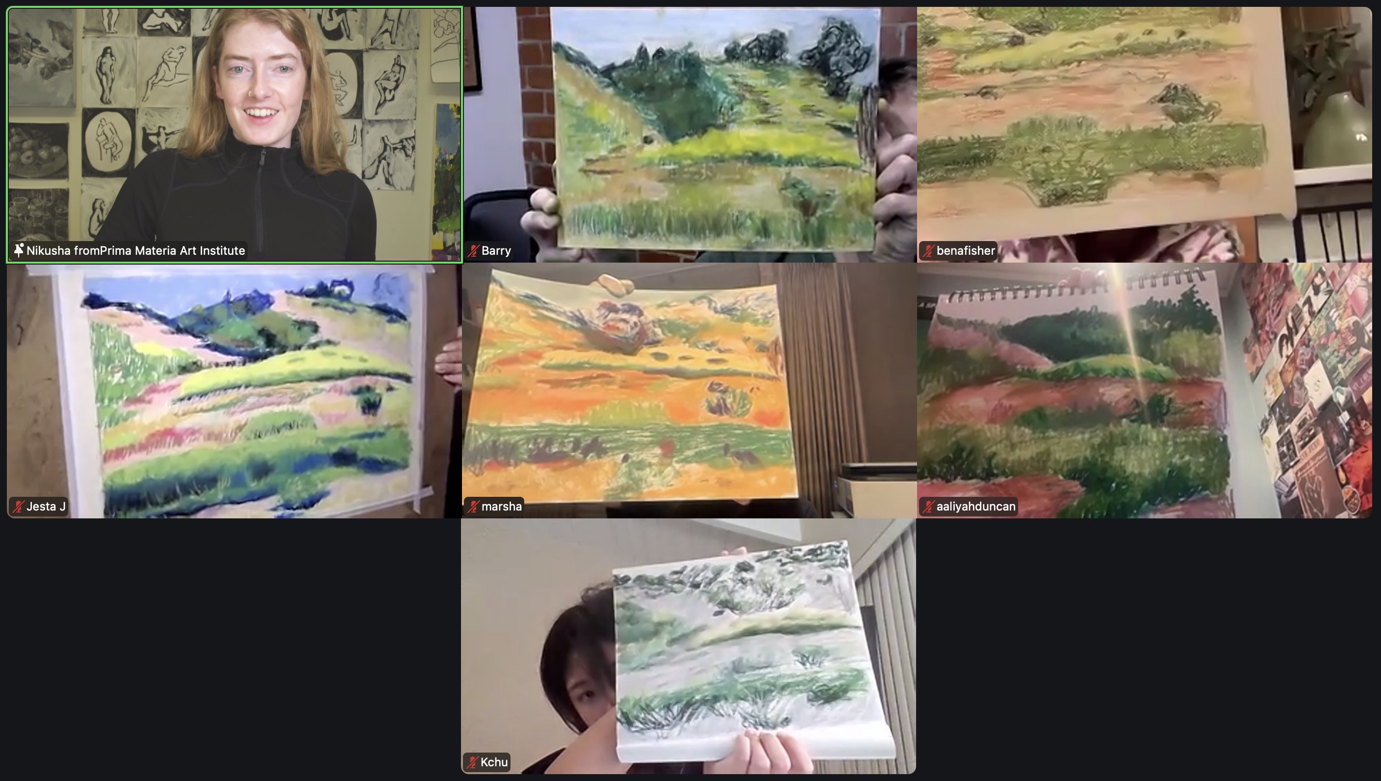
Finish your pastel landscape from class. In addition to focusing on color and tone, pay attention to texture!
When drawing, ask yourself how each area / plant is different from one another. Would you use straight lines, curly lines, wavy lines, interrupted lines, etc. Should the lines be vertical, horizontal, diagonal? Thin? Thick? It helps to actually ask yourself these questions, to help yourself see!
Finish your pastel landscape.
If you want to blend and retain colorfulness, only blend analogous colors (colors next to each other on the color wheel). Mixing complementary colors (colors opposite to each other on the color wheel) will result in browns/greys.
If you need to layer complementary colors over each other and want to still keep the saturation and vibrancy of each color, don't blend!
Finish your pastel landscape if you haven't yet. It's up to you how many details you add, if any. In Impressionist works, texture and details can be suggested because it's implied through mark-making.
Step back often, squint, and consider leaving it in a fresh state, or as my mentor Olya Losina says, "with the energy of a promise."
To prepare for week two, you can tape the borders of your pastel paper to a sturdy support board with artists tape, to prevent finger prints and accidental smudges on your drawing.
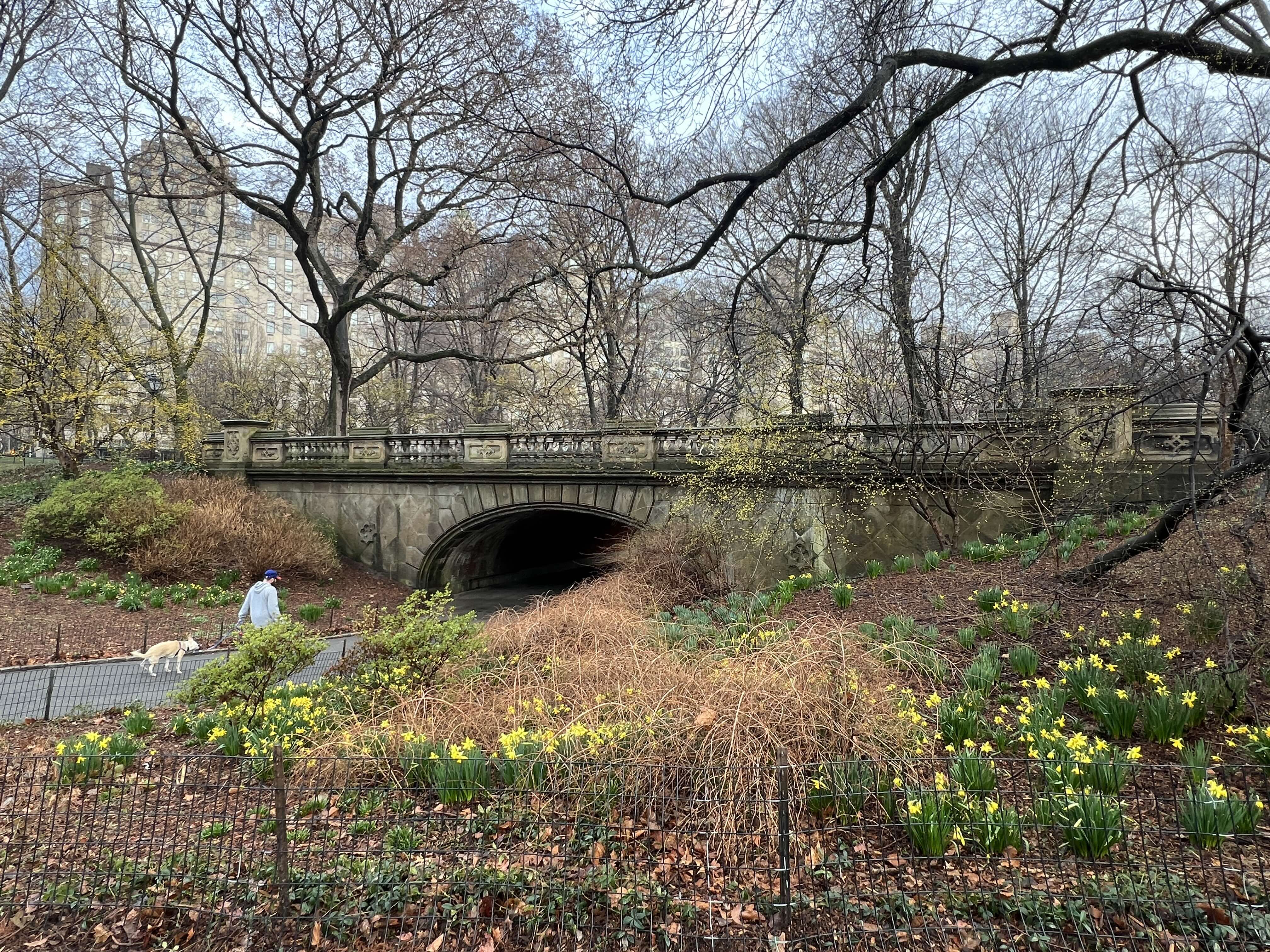
Want a closer look? Right-click and open in a new tab to view.